Showing posts with label V and A. Show all posts

Tuesday, June 15, 2010

1:1


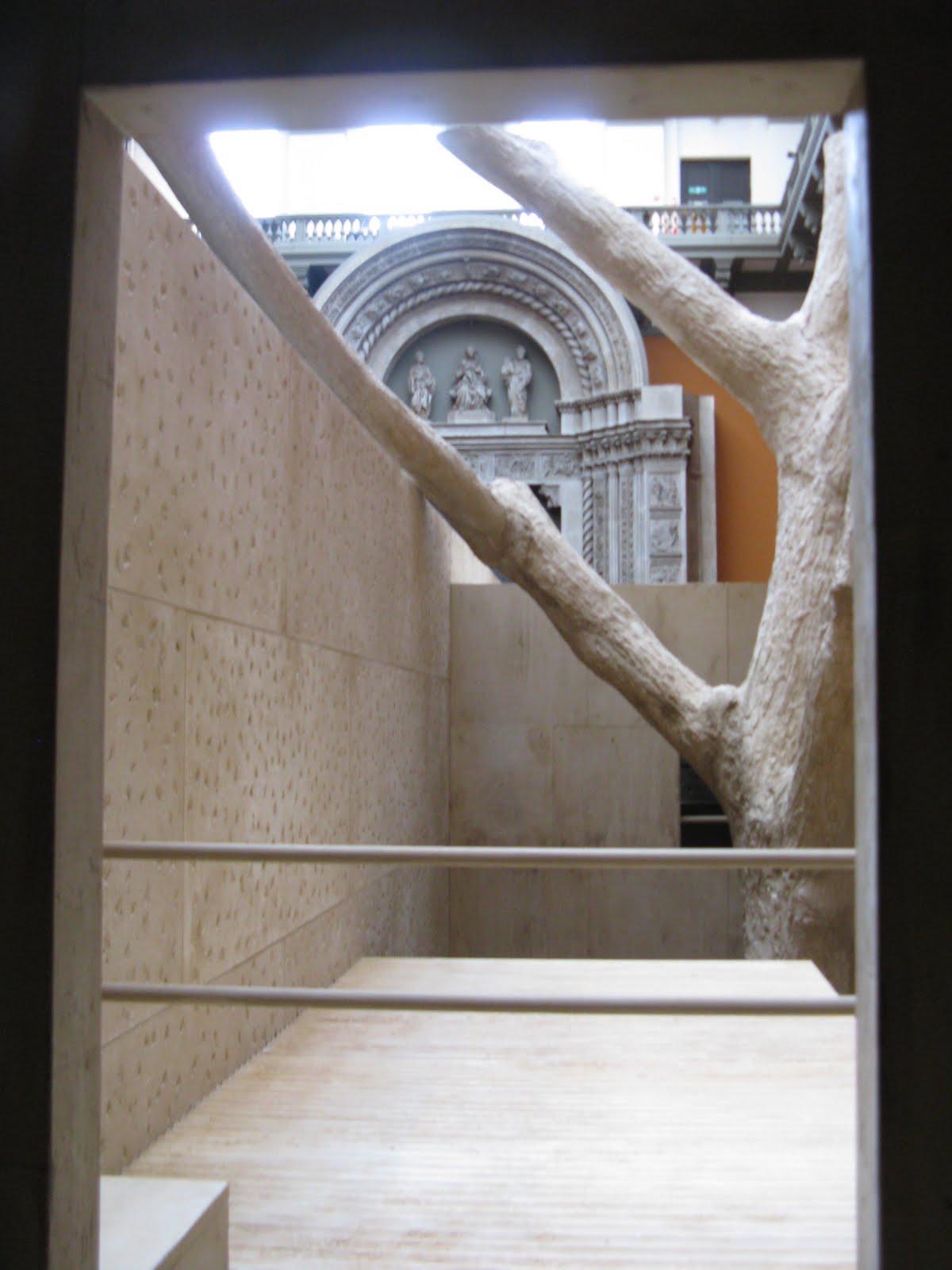
Yesterday evening I attended the opening of the free exhibition 1:1 Architects Build Small Spaces at the V&A, on until August 30. The exhibition features seven full scale installations of mini buildings at key points in the Museum: inside the newly opened Cast Courts gallery, inside the stairwell that leads to the National Art Library, in the John Madejski gardens, in the inside/outside space of the new Medieval and Renaissance Galleries of which I have already posted a blog, outside the Architecture Galleries on the fourth floor, and in the entrance foyer.

I was quite happy to wonder away from the star studded champagne-drinking crowd. This was an exciting mix of architects, fashionistas, designers and creative professionals, cultural trendy characters – the V&A’s secret visitors, those whom you would not catch sight of in the middle of a Saturday afternoon looking lost and slightly overwhelmed… but who turn up at the glitzy events.

All the structures can be climbed into – although bare feet are required in some – they have restricted capacity, sometimes for only 6 people at one time, and the wooden bookshelf building by Norwegian architects Rintala Eggertsson on 3 floors is wobbly when you get to the top. Which makes for a slightly seasick reading experience, but a visually exciting and imaginative connection between the inside of the house and the see-through bookshelves through which you stare at the National Art Library. I peeked through the books while holding onto the real stairwell banister – and the quote was... appropriate:
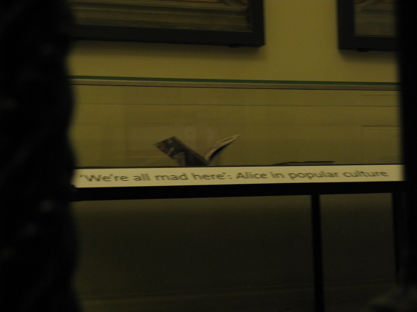
A surreal moment.

I found the Beetle’s House by Japanese Architect Terunobu Fujimori an exciting intervention for it seems to tug at our heartstrings, and it reminded me of something I have never actually built or owned personally – a tree house, a primeval children’s adventure.

The outdoor Ratatosk by Norwegian Architects Helen and Hard was great for people watching, and struck me as very empathetic to the extraordinary red brick facades with their Victorian Gothic arches which surround it. (The snapshot of the yellow heel which opens this blog belonged to a lady who was picking her way carefully over the soft cushion platform made from wood and bark chips on which the structure sits.)

In terms of the politics of space - and I base this on my viewing of the drawings and visuals from all the entries which are on display in the Architecture Gallery on the 4th floor - I think the original competition may have asked architects to visualise their minibuilding in one of the premium spaces of the Cast Courts – next to the plaster cast of Michelangelo’s David. This statue, which stands at 17 feet tall (5.7m), was the first major cast in the Museum’s collection, and is one of my true loves - the first picture below shows it before the 1:1 installation.

The installation that has landed what I consider to be the prize spot is by Indian Architects Studio Mumbai. It takes inspiration from the so called unauthorized structures that exist in Mumbai, narrow slithers of buildings “basically sandwiched between the outside wall of a warehouse and the boundary wall of a property”. (The images below are from the audiovisual in the entrance foyer - and express the architectural inspiration.)


The location of the structure - called In Between Architecture - in the Cast Court seems to create an unexpected conversation between two opposing ideas of public space: that defined on the one hand as the grand, sun filled, open piazza in Renaissance Florence, and on the other by the circulation thoroughfares in Mumbai today, that run through private dwellings, in between spaces, drawing the light in from slits above. Private spaces that symbolise the pressures on public space. (This is a view from the inside of the structure looking up - a plaster cast of a real tree, an organic form absorbed within the concrete shape sits central to the building.)

David stands taller than the structure, seeming to contemplate it with a certain wariness – and the dialogue is electrifying.


If you're in London, go and see it. If not, the website is: http://www.vam.ac.uk/collections/architecture/smallspaces/index.html


And... on a final note.

Walking past the V&A’s enormous halls in the evening, peering into the darkened galleries, contemplating the sleeping showcases and the objects inside them, quiet and still, is a beautiful, calming experience. I enjoyed this as much as the structures – and the other stunning architectural specimens which seem passé, redundant giants: the cast of Trajan’s Column for example, unceremoniously chopped into half to fit the void. What wonderful places museums are!


Monday, December 7, 2009

Medieval and Renaissance Galleries, Victoria and Albert Museum


The ten new galleries in the east wing of the V&A – which reopened last week to a tune of 32 well spent millions – are very impressive. I could not make the official opening, but pottered around on Sunday with a friend. Designed by McInnes Usher McKnight Architects, the spaces are extraordinary – especially the bizarre and extremely fun new link areas which have created new surface areas and volumes that can happily accommodate entire frontages of houses. We have, of course, seen this before, as museums worldwide struggle to find space in which to make publicly accessible their hidden collections, and re-invent galleries inside their buildings in which to do this. It requires gutting out and re-imagining outside spaces as inside spaces, and making the new architecture work with what remains of the historic building.

Many similar interventions have been hugely successful -
in primis Foster’s Great Court at the British Museum and I. M. Pei’s Deutsches Historische Museum in Berlin. On a smaller scale, but to refer to a project on which I worked, Terry Farrell Architects opening up of vertical circulation within the buildings of the Royal Institution in central London.

But at the V&A the visibility of these
innards – spaces that are external to the buildings that make up what we know as the V&A, an architectural jigsaw behind the unifying Edwardian façade – is bright, exciting and plain fun. It is as if the architects have imagined spilling objects out into the in-between spaces, playing between negative volumes on display and entrail volumes of the building.


Natural light floods in from above, accenting all those stupendous other sunlit marble halls dotted around the building, and the negative volumes sing out against the new spaces. It feels like walking around the cutout silhouette of the main galleries – exactly like when making Christmas biscuits you are left with the non-shapes, where circle sat next to rectangle – and you are left with whatever that in between end shape is. Walking through and around, you find yourself connected to the other galleries. It is a joyous, exciting and uplifting experience.


Sunday, June 7, 2009

ECSITE one month on


ECSITE this year - the annual conference of the European Network of Science Centres and Museums - was held in the Museo Nazionale della Scienza e della Tecnica in Milano, the most important national science museum in Italy, located a few steps away from the beautiful Romanesque church of Sant'Ambrogio. The amazing thing was that the Museum remained closed to the general public because of the conference - what a weird strategy, to isolate museum professionals from museum audiences! 

Having grown up in Milan, I remember the Museum from my childhood. It hasn't changed much, still priding itself on an amazing 1950s collection of wooden models of Leonardo machines - but I have. And returning to see it as an adult, and a museum professional, I couldn't but compare how these detailed - and aesthetically beautiful - models stand very little chance of making impact with any modern audience - even visitors to the extraordinary 2006 exhibition at the V&A entitled Leonardo da Vinci: Experience, Experiment and Design

There - a celebration of genius, a translation of a technical mind well ahead of his time into contemporary sophisticated computer animations centred on the Codex Forster, the manuscripts revealing the workings of his mind - truly his ideas and the contamination of languages. Here - a slightly dusty, self indulgent corridor of silent wooden models, accompanied by graphic panels. Little sense of the eye of the mind, of the man's curiosity, of his imaginative capacity. 

* * * * * * * *

While the Museo della Scienza's marketing campaign is highly visible, this image made me think about how the museum actually thinks of its visiting public on site - don't come through! no access! far from a welcome, the spaces seem shut, inaccessible, closed off. Mixed messages if ever I saw them. The banner, in Italian, says: How on earth can we claim to be open? Indeed - and I don't mean that just for the redevelopment phase.

Consider the following two images: both positioned on two station concourses, both illustrative - not truly interpretative, but giving the space a mood, communicating with visitors/travellers, enhancing the journey for passersby.


The question, obviously, is - which one do you prefer? The first one, glossy, quite fun - or the second one, placed behind a protective banner?

The first one makes me smile every morning during my commute through London Bridge railway station - especially the guy who has just been lobotomised, and the crying screaming kids.


This second one graces the solemn corridor concourse of the Padiglione Ferroviario (the Railway Pavilion) in the Museo della Scienza.  

Kind of desperate - impersonal, and once again - ALL VISITORS TO STAY BEHIND THE BARRIER!!! Do not approach the... graphic panels? Also - beware the risk of electrocution!

Oh dear. If museums are about communication, which I truly believe, the Museo della Scienza has still a long way to go. Even train companies are better.